
.jpg)
Your SaaS landing page is often the first meaningful interaction potential customers have with your product.
Getting it right means the difference between capturing leads and losing them to competitors.
In this guide, you'll learn proven landing page practices drawn from our experience working with successful SaaS companies. We'll dive into:
- Essential elements that drive conversions, supported by concrete data
- Real examples from SaaS companies that achieved significant results
- Common issues that hurt conversion rates and how to fix them
- A practical implementation process you can follow
The strategies we'll discuss aren't theoretical - they're backed by results from real SaaS businesses:
- A SaaS company that gained 1000 new users in their first week after implementing these principles
- An AI startup that closed 15 deals in their first month post-launch
- A B2B software provider that increased their traffic by 400% through focused messaging
By the end of this guide, you'll have a clear understanding of:
- Which landing page elements actually impact conversion rates
- How to implement these elements effectively
- How to measure and improve your results
SaaS Landing Page Best Practices
Each element of your landing page should serve a clear purpose. Let's examine the key components that drive conversions, with examples from successful implementations.
Clear Value Proposition
Even if your SaaS product has a strong value proposition, communicating it poorly will lower conversion. The most crucial task is conveying exactly how your product will either make money for your prospects or make their lives easier.
Creating a clear value proposition isn't just about having good copy—it's about making an immediate impact. Data shows that websites with well-articulated value propositions can see even a 34% improvement in conversion rates.
Here are key principles for effective value propositions:
- Focus on specific customer outcomes
- Communicate benefits quickly and clearly
- Address pain points directly
- Avoid technical jargon and buzzwords
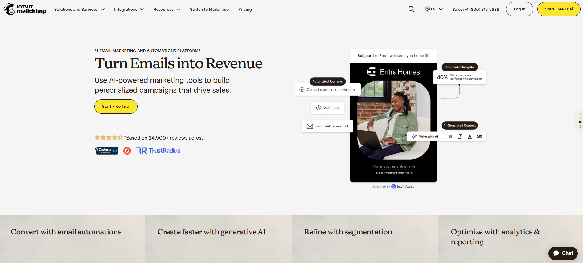
Let's have a look at how A-class SaaS brands handle that. Mailchimp is a widely recognized email marketing platform. While their historical "Grow your audience and your revenue" was solid in communicating benefits, the current version is even more direct. Notice how the subheading and the four product sections below support that promise and showcase their features:
Strategic Visual Design
Poor web page layout can pull prospects' attention away from where you want it and dilute the focus of your messaging. Effective landing page design isn't just about looking good—it's about guiding visitors' eyes to key information in a logical sequence.
Through our work with numerous SaaS brands, we've found that successful landing page layouts:
- Direct attention to your main value proposition first
- Guide visitors' eyes naturally through the content
- Ensure CTAs stand out from the rest of the page
- Use whitespace strategically to maintain focus
- Keep key elements above the fold
One of the websites that really hits home regarding strategic visual design is Mixpanel. From the very second you show up on their page, everything makes sense all the way down to the final CTA section. The hero section clearly reveals their value and what the benefits of their product are, which is supported by a dashboard sneak peek, highlighting insights for the user:

And it's a feast for the eyes with each scroll. The sections are vivid, easy to grasp, and super intuitive to take further action. What also works very well are 2D animations showcasing their interface. Show, not just tell, but on steroids!
Effective CTAs
Your call-to-action buttons are critical conversion points. Data shows that using contrasting CTA buttons can improve conversion rates by up to 34%. However, it's not just about making buttons stand out—it's about creating a sense of urgency and clarity in your action steps.
Effective CTAs should:
- Use contrasting colors to stand out from the page
- Keep text simple and action-oriented ("Start Free Trial", "Book a Demo")
- Create a sense of urgency in decision-making
- Be strategically placed throughout the page
- Clearly communicate the next step
.png)
Without a clear, compelling CTA, prospects won't feel motivated to take immediate action. They'll tell themselves they can come back later—and often never do.
Sometimes, you might feel tempted to jazz up the CTA copy to avoid sounding generic like "learn more." But this can easily backfire because your website visitors might find it confusing. It's best to hit the sweet spot - avoiding vague text like "get started" WHILE being clear about the action you want visitors to take. Example? Loom did a pretty good job on their page:

Social Proof
In SaaS, building trust is essential for conversions. Data shows that displaying testimonials can lead to a 34% increase in conversion rates. Social proof helps potential customers see that others have already benefited from your solution.

Effective social proof elements include:
- Customer testimonials and success stories
- Client logos from recognizable companies
- Specific data about customer results
- Detailed case studies
- Integration partner logos
If you're looking for more benchmarks when it comes to a compelling social proof section, then head to Airtable's website. While their solutions pages come with testimonial quotes reinforced with brand logos and names, their home page brings even more excitement to the table. They've developed a slider with their customers' success stories, where the very first one has an eye-catching video in the background:

The Ramp example, below, takes social proof to another level with an evocative question: "What would you do with more time?"

This approach immediately frames their solution around the benefit (saving time) rather than the feature. They then back this up with impressive data ("Over 10 million hours saved for 30,000+ customers") and showcase diverse customer stories with compelling visuals.
This approach is particularly effective because it connects emotional benefit (more time) with tangible proof (millions of hours saved) and real-world applications (varied customer examples).
When implementing social proof, authenticity matters more than quantity - real results from real users are more compelling than vague endorsements.
Video Content
The role of video on SaaS landing pages presents an interesting challenge for marketers. While some studies have suggested dramatic conversion improvements of up to 80%, more recent research from Unbounce analyzing 35,000 landing pages found that video impact varies significantly by industry and implementation.
For SaaS products specifically, video remains a powerful tool for explaining complex features and demonstrating functionality that might be difficult to convey through text and static images alone. However, its impact on conversion should be measured rather than assumed.

When implemented thoughtfully, product videos can:
- Demonstrate key product features in action
- Keep length under 2 minutes to maintain attention
- Focus on solving specific user problems
- Show clear use cases and outcomes
- Include captions for accessibility
When prospects can see your product in action, they better understand its value and are more likely to convert. A well-crafted product video can convey in two minutes what might take several pages of text to explain.
Strong Headlines
Headlines that clearly state benefits can increase conversions even by up to a whooping 95%. Your headline is often the first thing visitors see—it needs to immediately communicate value.
Strong headlines should:
- Focus on clear, tangible benefits
- Speak directly to user pain points
- Avoid vague or generic statements
- Use simple, direct language
- Highlight what makes your product unique
For example, Lemlist's headline "The only cold outreach tool that helps you reach inboxes and get replies" directly states the benefit while differentiating their product.

Another great example comes from Kajabi:

Their H1 covers a simple, powerful way to hit the nerve of their target audience with a straightforward benefit.
Focused Content
Pages with a single, clear message matched to targeted audience needs can significantly increase conversion. The key is avoiding clutter and multiple messages that might confuse visitors.
Unity demonstrates this well with their landing page, which:
- Maintains one core message about pipeline generation
- Keeps supporting content focused and relevant
- Uses clean layout to avoid distractions
- Presents information in a logical flow
- Backs claims with clear social proof

We've always advocated for crafting product and brand messaging that will create an "a-ha moment" among the target audience. This requires getting back to the drawing board and mapping out what you offer, to whom, and what's the most important benefit or pain-point killer in your offering.
A classic example of that approach is Fathom Analytics, who had the guts to challenge a mammoth - Google Analytics. They decided to be bold enough to state in their core message that they are GA's alternative, spotlighting two main benefits that are the direct opposites of GA's cons:

Detailed Product Description
Your product description should clearly explain what your product does and how it benefits users. Use visuals like screenshots or product demos to help prospects understand your product better.
Effective product descriptions:
- Focus on benefits rather than just features
- Use visual aids to demonstrate functionality
- Break down complex features into digestible pieces
- Show the product in real-world contexts
- Include clear next steps for interested users

Clay's landing page exemplifies this by showing their enrichment tools interface alongside clear benefit statements, making complex functionality easily understandable.
Implementation Guide
Now that we've covered the essential elements of high-converting SaaS landing pages, let's focus on how to implement these practices effectively.
Practical Steps to Optimize Your Landing Page
1. Audit your current landing page:
Before making changes, analyze your existing page to identify strengths and weaknesses.
- Review your current conversion rates as a baseline
- Evaluate each element against the best practices we've discussed
- Identify the biggest opportunities for improvement
2. Prioritize improvements based on impact:
Not all changes will have equal effect.
- Start with your value proposition and headline
- Focus next on your primary CTA
- Then address visual hierarchy and layout issues
- Finally, enhance supporting elements like social proof and product descriptions
3. Implement A/B testing:
Don't rely on assumptions.
- Test one element at a time to measure specific impact
- Run tests for statistically significant periods
- Document what works and what doesn't
- Use findings to inform future optimizations
4. Monitor metrics beyond conversion rate:
Look at the complete picture.
- Track time on page and bounce rate
- Analyze user flow and exit points
- Monitor engagement with specific elements
- Collect qualitative feedback when possible
Focus on Quick Wins
When optimizing your landing page, some changes can deliver immediate results:
- Headline clarity: Simply rewriting your headline to focus on a specific benefit can significantly impact conversion rates.
- CTA contrast: Ensuring your call-to-action buttons stand out visually is one of the easiest and most effective changes you can make.
- Above-the-fold content: Reorganizing your most important information to appear before users need to scroll often delivers quick improvements.
- Add testimonials: If you already have customer quotes or case studies, adding them strategically near decision points can boost confidence.
- Reduce form fields: If your conversion requires a form, reducing the number of required fields often increases completion rates substantially.
Common Pitfalls to Avoid
Even well-intentioned optimization efforts can go wrong. Here are common mistakes to avoid:
- Overloading with information: Adding too much content, even if it's valuable, can overwhelm visitors and reduce conversions.
- Conflicting calls-to-action: Multiple CTAs competing for attention often result in no action at all. Maintain a clear hierarchy.
- Generic messaging: Vague value propositions like "best-in-class solution" without specific benefits rarely convince prospects.
- Ignoring mobile users: With increasingly mobile traffic, failing to optimize for smaller screens can sacrifice a significant portion of potential conversions.
- Set-and-forget mentality: Landing page optimization is an ongoing process, not a one-time project. Markets, competitors, and user expectations evolve.

Remember that landing page optimization is both an art and a science. While these best practices provide a strong foundation, continuous testing and refinement based on your specific audience will ultimately deliver the best results.
Ready for a real treat? We have a solid take-away for you!
Structure and Flow of the Homepage
- 🦸🏻♂️ Hero Section:
This is the first touchpoint for visitors and should include:
- A main value proposition that succinctly states what your product does.
- A primary CTA, such as “Try for Free” or “Book a Demo,” designed to capture immediate interest.
- A strong visual or hero image that complements the value proposition.
- 💰Value Proposition:
- Clearly articulate the core benefits of your product in a concise statement.
- Address directly how your product resolves specific pain points of your target audience.
- ✅ Social Proof:
- Showcase logos of well-known clients, user testimonials, and relevant statistics to build credibility.
- ❓What is Your Product:
- Describe in more detail what your product does, focusing on benefits rather than features.
- Use visuals like screenshots or videos to help explain complex features simply.
- ➕ Benefits Section:
- Highlight the key benefits of your product, ideally three, focusing on how they solve users’ problems.
- 🤔 How It Works:
- Provide a step-by-step guide or a simple explanation showing how easy it is to get started with your product.
- ⚙️ Integrations:
- Display key integrations that enhance your product's value, showcasing compatibility with tools that your target audience already uses.
- 💬 Testimonials:
- Include impactful customer stories and quotes that validate the effectiveness of your product.
- 💡Use Cases:
- Explain different scenarios or case studies where your product can be applied, enhancing understanding of its versatility.
- 📞 Call-to-Action (CTA):
- Repeat the primary CTA, encouraging users to take action, such as signing up or requesting a demo.
Ready to Transform Your SaaS Landing Page?
If you're looking to implement these best practices but aren't sure where to start, we can help. At GRAFIT, we specialize in creating high-converting landing pages for SaaS companies that drive real business results.
Whether you need a complete landing page redesign or strategic optimization of your existing page, our team combines conversion expertise with outstanding design to deliver pages that not only look great but perform even better.
Book a free landing page audit
During this 30-minute session, we'll analyze your current landing page, identify the biggest opportunities for improvement, and provide actionable recommendations to increase your conversion rates.

Get a free consultation

.jpg)


